original

got feedback from lauren.
prioritized hierarchy (i.e. title first, images second, lyrics third): made font box and lyrics text larger and more legible; made the title of the song the focus rather than the artist. enlarged album cover and positioned to the left of lyrics to utilize more space.
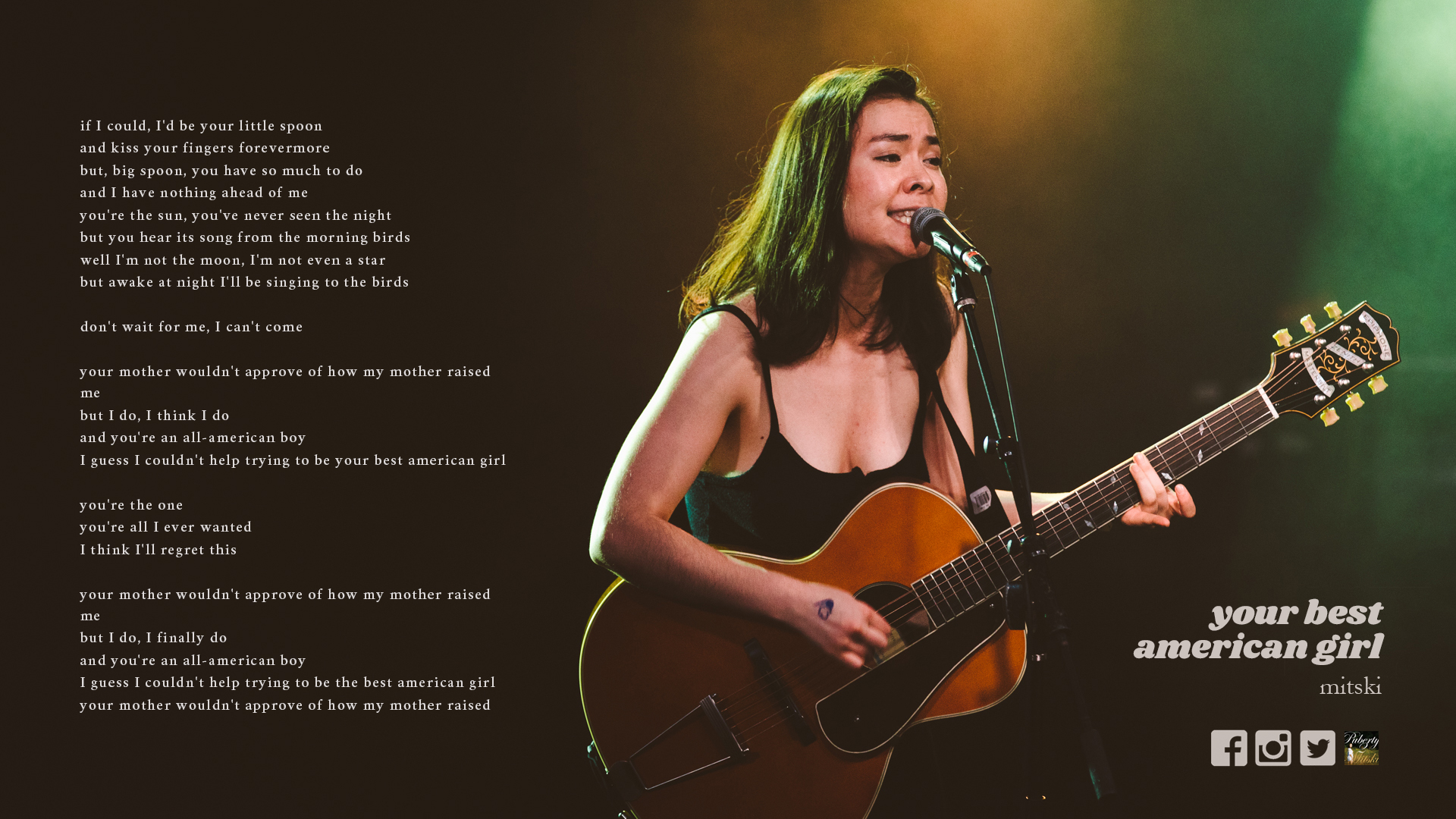
after taking into consideration lauren and james' comments, aligned song title and artist & buttons to the right, and larger lyrics to the left, with no box. fixed background, song & artist titles, and buttons, scrolling text.